experiments

This was a traditional experiment where I explored the word fragmented by cutting various coloured paper into triangles and gluing them together until it resembled a face. The larger triangles made up the less detailed parts of the picture such as cheeks, neck, hair etc... and smaller triangles were used for the nose and eye areas. I chose the colours from my colour palette that I decided on at the beginning of the project ; cool blues and purple tones. I found that the facial features weren't very distinguishable from the rest of the face so I drew with a black sharpie some vague cartoon-like features. I like how this relates to my project because a face was made using pieces I found, which fits the metaphor of the paper being life, experience or characteristics and they are all stuck together to make a unique person.
This was an experiment using a digital painting I made. I used various Photoshop filters and picked out these two to show the theme of the project. The first is a mirror filter with the picture divided up - showing division and reflection. Her face is distorted and she isn't seeing a clear reflection of herself. Its difficult to tell her facial expression and where she is looking.
The second image is a glowing edges filter which is very beautiful- it resembles stars and neon lights. This is a more colourful approach to fragmented, I picket out words such as rainbow, lively, chaotic.


My first thought for the word fragment was shattered glass, so in these images I tried to get the effect of smashed glass. I took an image and duplicated it underneath then cut triangles out of the top layer using the lasso tool and moved them to a new position. With the sunset picture I used a cartoon lines effect because I thought it suited a comic book style.
For the painting I used a mosaic filter and layered them up, removed parts I didn't want until I had an interesting image. I think the effect of this image is very effective and definitely has meaning. I like the contrast between these two. I couldn't put their meaning into words but the sunset feels quite warm, positive and energetic whereas the girl feels sad, broken, disappearing.
This experiment was to test how I would make a face have the effect of kintsugi.
I started with a sketched idea as to how and where I would put cracks in the face, I then took it into Photoshop and tried a few different brushes out to see which one would give the best effect. I painted the face and added in the gold using colour dodge for a glow and I varied my pen pressure. I played around with the colours of the image too and settled for the blues and golds. I love making the eyes stand out because I feel that is what draws you in the most. So I used turquoise eye colour and a contrasting orange eye shadow. This gave me the idea to explore an artist who paints eyes (to look at emotion for fragmented).
I love the effect of this brush and I would like to explore more with what I can do with it.


These are responses to an artist recommended by another student. The artist (Barbara Kruger) uses text on black and white images to comment on society. I found that it would fit with my project too because it has the same emotion.
I focused on separation and loneliness here with the spaceman floating through space, away from his ship and no one around. The separation is also communicated through the text splitting up the picture. I also made him floating because in this approach to the word, fragmented would be a empty, disjointed feeling and I feel that floating is an accurate physical sensation for this emotion. The lack of colour against the bold red boxes also has the same feeling, it is somewhat aggressive or alarming- no matter what is going on in the rest of the picture, the words are all you can focus on. It would be fitting for themes of depression or anxiety.
This was another recommended artist- Thomas Saliot who paints eyes in a messy way on large canvases.
I found a image of his work that I liked and tried replicating his style in Photoshop. I have screenshots of the process.
I liked the idea of painting just the eyes because I love the emotion that can be read when that is the only feature you can see. I was working again with the word reflection - here emotion is reflected in the eyes. I chose to do this artist to try a different art style; I usually go for a quite detailed and realistic look so it was a challenge to do something more messy and improvised. I love the effect of this look, imperfect but beautiful- like the theme of my project. I will continue to experiment with this and see what other effects I can get. I will also continue to experiment with 'reflections' because that is the word that I have the most inspiration for.
.jpg)

Here I have done some quick double exposures as a response to the artist Andre de Freitas who uses double exposure with b/w images of landscape and portraits. I used my first hand images to explore photography. I like this effect because it is as if you, the viewer, can see what the subject is looking at, while also seeing them which makes the image more interesting. I prefer the top image, with 1 black and white image and 1 colour because I found that both b/w images get lost and some of the features are hard to tell apart.
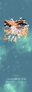
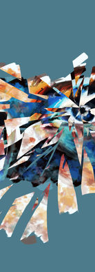
Here are some experimentations of my eye painting. I have tried using it as a phone wallpaper to test out what my product could be used as, I have used the triange shattered effect from before, I have incorporated text, I have tried using b/w and colour layers like Freitas and using negative parts of the image like Kruger.


Here I combined the styles of Yossi and Thomas' work. I started with the painting in the style of Saliot, then I added some random brush strokes, paint splatters and lines etc... I think this response is quite messy, although intentional. It doesnt quite work with the bright colours so I would use darker colours next time. However this gave me the idea to break it up more and play around with shape to fit more with my theme.
Here I made a quick test using a Photoshop filter on my collage to see how abstract it can be while still being clear. the first image is using many large shapes and is quite blocky and blended, the second is somewhat understandable, but still now quite clear and the thrived is a good level. You can see what the image is of yet it still looks simple.


Tutorials for reflective objects
Response


I came across this image on pinterest while looking for inspiration so I decided to make a quick response to it. I find this image interesting because the broken up face that switches feels like a fix of emotion, feeling to different things at once or there being two sides to something. In the context of the project this image symbolises the different interpretations of the word fragmented- positive and negative. the red and blue are colours that people associate with calm and anger.


